

Mrs Eaves Type Specimen
Questo progetto è stato realizzato per il corso di Typography Design, durante il secondo anno del corso di laurea in Design della Comunicazione al Politecnico di Milano.
Il lavoro consiste nella realizzazione di uno specimen tipografico di una font esistente e una composizione tipografica di un testo ("Esercizi di stile" di Raymond Queneau).
This project was made for the Typography Design course, during the second year of Communication Design degree course at Politecnico di Milano.
The task consists in creating a typographic specimen of an existing font and a typographic composition of a text ("Exercises in Style" by Raymond Queneau).

Cover

History of the font
Originally designed in 1996 at Emigre's type foundry, Mrs Eaves was Zuzana Licko's first attempt at designing a traditional typeface. Licko's typographic career progresses in parallel with the evolution of Emigre as well as the Macintosh computers, which she uses to design typefaces, including Mrs Eaves. While Licko initially decided to design a traditional text typeface, it was never specified how Mrs Eaves could be best used, but if there is a particular common use that stands out, it must be literary: Mrs Eaves adorns book covers, but it is equally suitable for a wide variety of other contexts such as CD covers (Radiohead's Hail to the Thief), restaurant menus, logos, and poetry books, where it gives an elegant presence to short texts. An area where it seems less usable is in setting long texts, which it can handle well only if there is ample space.
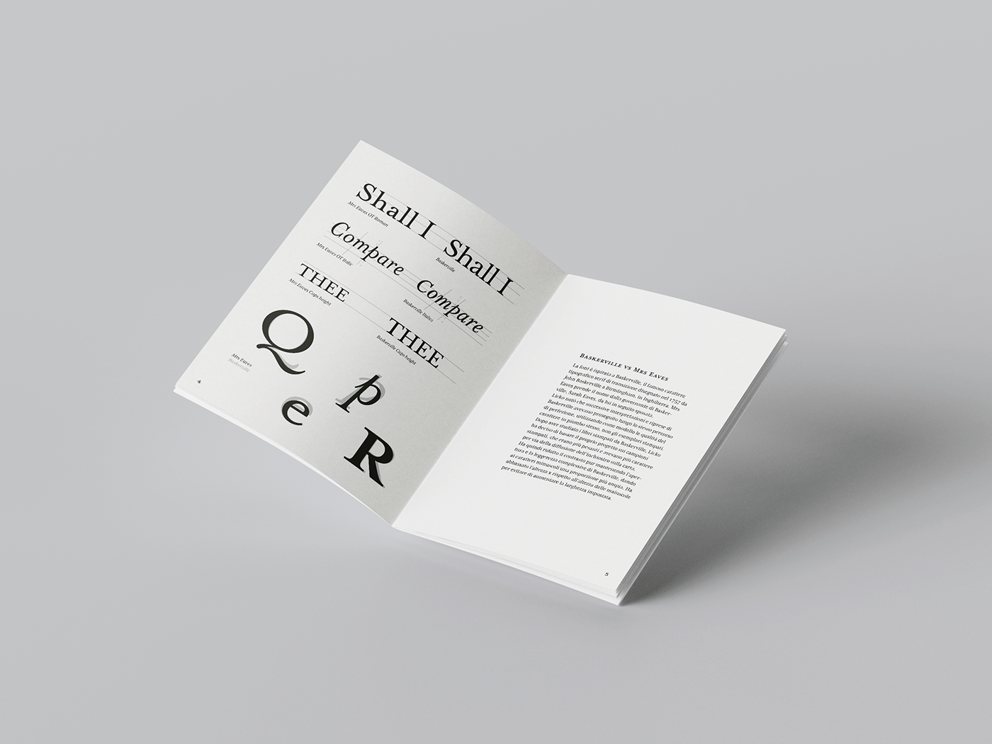
Mrs Eaves – Baskerville Comparison
The font is inspired by Baskerville, the famous serif transitional typeface designed in 1757 by John Baskerville in Birmingham, England. Mrs Eaves is named after Baskerville's housekeeper, Sarah Eaves, whom he later married. Licko noticed that subsequent interpretations and revivals of Baskerville had continued along the same path of perfection, using the qualities of the lead typeface itself as a model, not the printed specimens. After studying Baskerville's printed books, Licko decided to base her design on the printed samples, which were heavier and had more character due to the ink spreading on the paper. She then reduced the contrast while maintaining the overall openness and lightness of Baskerville, giving the lowercase characters a wider proportion. She lowered the x-height relative to the height of the uppercase letters to avoid increasing the set width.
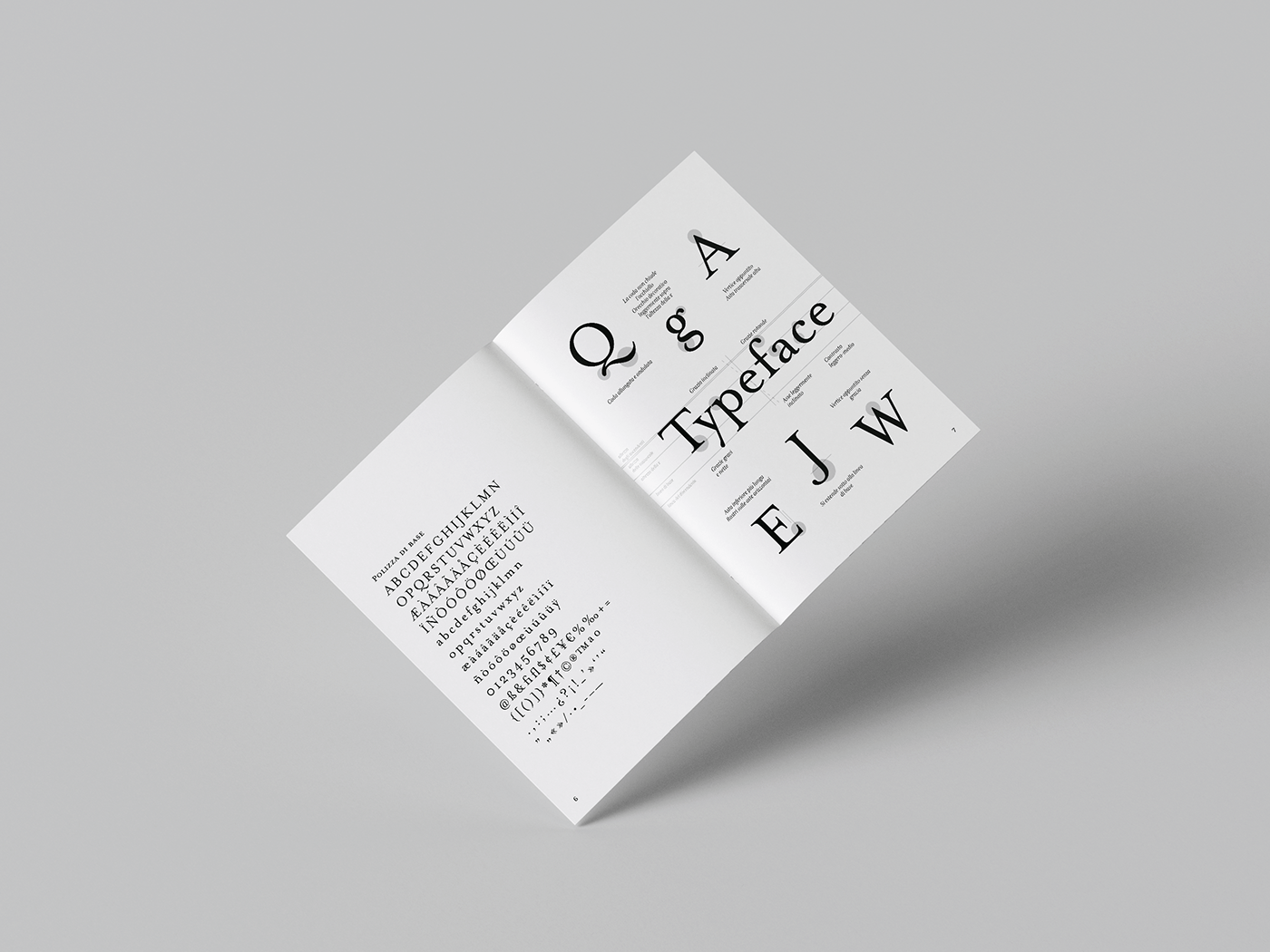
Glyphs – Characteristics of the font

Raymond Queneau, "Exercices de style" – Exercise 84
Poor lay Zanglay:
"Ung joor vare meedee ger preelotobus poor la port Changparay. Eel aytay congplay, praysk. Jer mongtay kang maym ay lar jer ay ger vee ung ohm ahvayk ung long coo ay ung chahrpo hangtooray dunn saughrt der feessel trayssay. Sir mirssyer sir mee ang caughlayr contrer ung ingdeeveeduh kee luhee marshay suhr lay peehay, puhee eel arlah sarsswar. Ung per plus tarh jer ler rervee dervang lahr Garsinglahzahr ang congparhrgnee d'ung dangdee kee luhee congsayhiay der fare rermongtay d'ung crang ler bootong der song pahrdessuh."
– Raymond Queneau, "Exercices de style", Exercise 84

Ligatures
Mrs Eaves is particularly known for its range of ligatures, which range from common to fanciful and include intertwined and fluttering designs. The ligatures in all variants of Mrs Eaves include the standard ligatures fi, ffi, and fl, as well as the classic 18th century ligatures ct and st, and others without historical precedent.

Font family & Weights – Test text
«I think Mrs Eaves was a mix of just enough tradition with an updated twist. It’s familiar enough to be friendly, yet different enough to be interesting. Due to its relatively wide proportions, as compared with the original Baskerville, it’s useful for giving presence to small amounts of text such as poetry, or for elegant headlines and for use in print ads. It makes the reader slow down a bit and contemplate the message.»
– Zuzana Licko about Mrs Eaves

Bibliography:
Stephen Coles, "The Anatomy of Type: A Graphic Guide to 100 Typefaces", Harper Design, 2012
Paul McNeil, "The Visual History of Type", Laurence King Publishing, 2017
Sitography:
Corso di laurea in Design della Comunicazione
AA. 2022-2023
Corso di Typographic Design
Docente: Alessandro Colizzi


